A/B Test Ideas for E-Commerce Call to Action Buttons
A call to action on a website is meant to solicit action—a click—from a visitor. Applying best practices in call to action button design is a good place to start, then realize that each best practice should be put to the test.


A call to action on a website is meant to solicit action—a click—from a visitor. On e-commerce sites, the most obvious actions are adding an item to the cart/bag, proceeding to the next step in a checkout funnel, and the ultimate call to action—confirming the purchase. Applying best practices in call to action button design is a good place to start, then realize that each best practice should be put to the test.
All the best practices in the world cannot predict how customers will behave. Here is a list of test ideas ordered by how we think you should test them:
Button location, size, and quantity
“The placement of call to action buttons on a web page is critical to drawing the eyes of visitors.” –Call to action best practices
Test the distance of a button from the product image. The location of a button in relation to the product details and product image is hugely impactful to a seamless user experience. Here are a few examples:
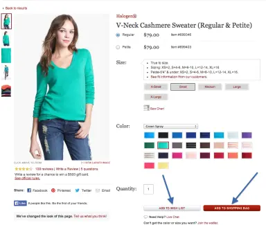
Nordstrom.com puts their call to action at the bottom of the product page.
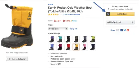
Amazon.com puts the button on the top right with all the product detail below.
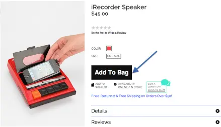
Urbanoutfitters.com puts the button right next to the product image.
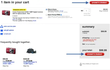
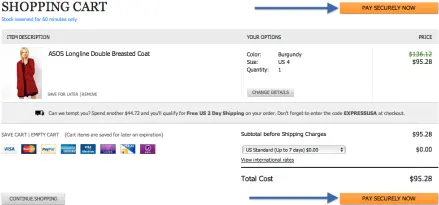
Test the number of “continue” buttons within the checkout funnel. Does having two buttons—one above the cart details and one below—increase conversions?
Target.com has two “proceed to checkout” buttons.
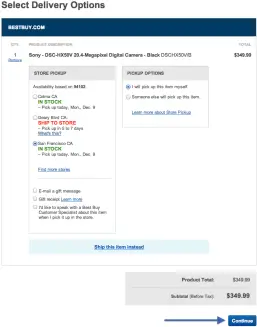
BestBuy.com has one “continue” button below the cart details.
Asos.com has two places to continue to the next page in the funnel.
If you have two call to actions on one product, test position and size of each.
“In web pages, the size of an element relative to its surrounding elements indicates its importance: the larger the element is, the more important it is.” –Call to action best practices
If a user has to actively look for the button to checkout, or go to the next page, that’s a sign of a bad experience.
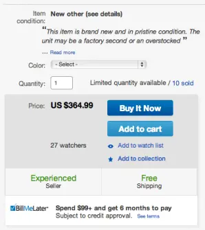
What button is most important, “add to cart” or “add to wishlist”? If you have a “buy it now” and “add to cart” option, which one do you order first?
eBay.com positions the “Buy it Now” button on top of the “Add to Cart”.
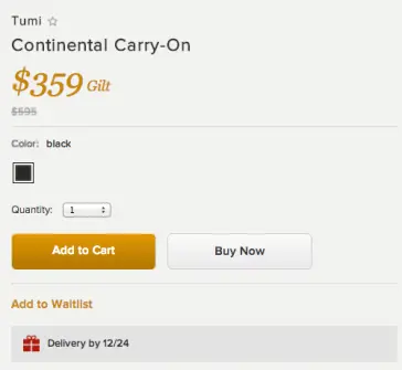
Gilt.com places “Add to Cart” next to “Buy Now”.
Test making one of the secondary calls to action a plain text link instead of HTML.
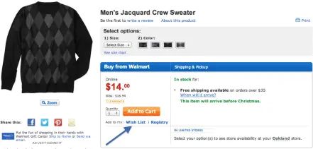
Walmart uses plain text for its “add to wishlist” call to action.
Colors
“Use colors in your call to action buttons that have a high contrast relative to surrounding elements and the background because it is critical to ensure that the user notices your call to action.” –Call to action best practices
Test highly contrasting colors on your call to action buttons versus brand colors. When it comes to call to actions, it’s OK to stray away from brand colors in favor of a color with stark contrast to the background and surrounding elements.
Zappos.com uses green for the “add to cart” call to action button and the price color. All cart call to actions are bright orange.
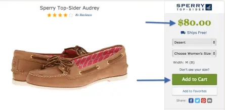
Whereas all calls to action on Target.com reflect their brand color, red.
Hover state is a small detail to consider around color. Ensure shoppers know they are hovering in the right place by giving the button a hover color.
Wording
It’s best practice to use words that create a sense of urgency and tell users what to expect, but what are these words? You could see a surprising difference in conversion just by testing “Checkout” vs. “Proceed to Checkout”.
Insound.com tested four different variations of the button on the penultimate step in their checkout funnel. They measured to see whether “Review Order”, “Continue”, “Submit” or “Almost Done!” generated the most clicks. One button increased conversion rate in the funnel by 8%!

