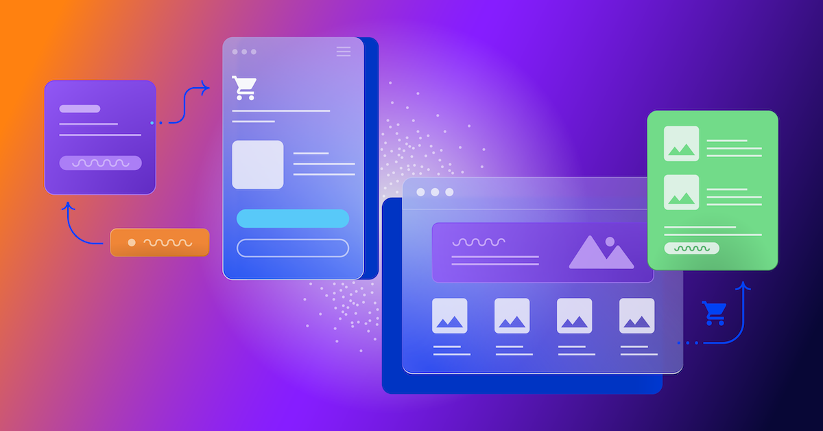
21 Ideas to Increase Revenue From Your Online Store
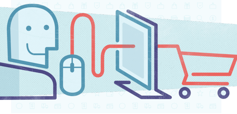
The bad news: If you have an e-commerce website, mobile site, or mobile app, it’s likely that up to 72% of shoppers abandon their shopping cart before completing a purchase in your store.

Robin Johnson
The good news: This post (and a little optimization) will help you fix that.
Here at Optimizely, we work with a number of retail teams who are experimenting with new and unique ways to drive revenue from their online stores. I recently spoke with several of these retailers and others experts to learn about their successes and failures, and have combined my findings into our latest long read: The Ultimate Guide to Optimizing Your Online Store.
This post summarizes some of the test ideas retailers have found most impactful for optimizing the experience they deliver shoppers.
Checkout Funnel Optimization
84% of online shoppers expect an online transaction to be completed in less than 5 minutes. Do you know how long it takes your average customers to check out successfully?
The checkout funnel is ideal place to start testing, because funnel tests are closest to your primary conversion (a purchase) and are more likely to have a direct impact on your key success metrics (revenue). Plus, in testing the funnel, you’re serving experiments to a more qualified audience: shoppers who have already signaled a high level of interest in your offering.
Goal: Move shoppers through the checkout funnel to increase purchases and revenue.
High impact test ideas:
- Test the placement and prominence of your primary CTAs. For an e-commerce site, these are likely the the “Add to Cart” button on your product pages and the “Continue to Checkout” CTAs from there. Try adding duplicate CTAs above and below the fold to give shoppers more opportunities to click through.
- Test out different CTA messaging and text. “Buy Now” vs. “Purchase” vs. “Add to Cart” vs. “Checkout”. Oftentimes, more descriptive text results in more clicks.
- Try increasing your CTA button sizes. Larger buttons tend to make it easier for shoppers to travel through your funnel, particularly on mobile.
- Question the assumption that e-commerce security badges increase trust.
- Try using CTAs as a progress meter, telling customers how many steps are remaining in the process. For instance, if there is one page remaining the in the checkout funnel, the your CTA could read “You’re almost there! Just one step to go.”
- If you have an important value proposition, such as “Free Shipping” or “Easy Returns”, try featuring it as close to the primary CTA as possible. Read more on this test idea.
- Remove things like product offers, badges, promotions, or shipping information from each page of the checkout flow. Oftentimes, shoppers prefer a simplified experience.
- Make coupon code fields less prominent. When shoppers see a coupon field they tend to feel less special. They may open a new tab to search for a discount code. If they don’t find what they’re looking for, they’re even more likely to abandon the purchase.
- Try removing navigation to any page outside the checkout funnel. This will help shoppers keep their eyes on the “checkout prize” and eliminate the risk of distraction.
- When a shopper clicks an item to add it to their cart they are no longer browsing, they’re purchasing. Make it as obvious as possible that the item ended up in their cart and make it easy for them to continue down the purchase funnel from there. Many e-commerce sites do this with a subtle animation, revealing a window that shows the product in the cart with a dedicated CTA to nudge them along through checkout.
Homepage Optimization
The homepage is often a shopper’s first impression of your retail site, so it’s important to get it right. Testing and optimization can help you determine how to make the best use of this precious real estate.
Goal: Drive more visitors to product and category pages
High impact test ideas:
- Test different messaging, tone, and voice to see which resonates best with shoppers. One example is to experiment with is benefits- versus loss-driven messaging. Benefits-driven messaging focuses on what the shopper will gain, such as a huge discount or sale: “Buy now and save 40% on our new spring collection!” Loss-driven messaging plays into a buyer’s FOMO (fear of missing out): “Don’t miss out! Only 1 day left of our biggest spring sale yet!”
- Experiment with different homepage layouts and designs. Start with major changes and then hone in on smaller tweaks from there.
- Your homepage is your front page. Just like a newspaper, experiment with using the homepage to announce new products, offers, or sales.
- While you might find them pleasing to the eye, rotating carousels and large homepage hero images have been found to decrease conversions on most e-commerce homepages. Test it out on your own site.
- Experiment with different types of product imagery.
Social Share Optimization
Recommendations are extremely influential on a person’s buying decision. In fact, 81% of shoppers say posts from their friends have directly influenced their purchasing decision. You can encourage more shoppers to share on your site by optimizing the sharing process.
Goal: Increase positive social shares, which correlate to more purchases and revenue from your site
High impact test ideas:
- Test various designs for your social share buttons. Do shoppers interact with social share buttons that are above or below the fold? How about a scrolling social share widget? Test it out to see what works best on your site.
- Try different incentives and offers to see what compels more people to share widely. You can offer different referral codes for incentives and measure which codes are used most
- Experiment with timing. When is the best moment to ask for the review or social share? Is it during the shopping process? Immediately after the purchase? Or further down the line?
Pricing, Shipping, & Offer Optimization
Finding the right price point or shipping option can drive more visitors to make a purchase.
Goal: Maximize revenue by finding a price point that provide the greatest ROI to your business and the greatest value to your customers.
High impact test ideas:
- Experiment with free and discounted shipping offers to see if they result in an increase in purchases that is revenue positive when paired with the discount you are offering.
- Test having checkboxes auto-selected as default. For example, a customer’s billing address could be defaulted to the same as their shipping address.
- Try adding or removing promotional offers. In some cases, a promotional offer may actually distract users from the purchase at hand. Test this hypothesis out on your site to see what your shoppers prefer.
These optimization ideas are a great starting point, but are just the tip of the iceberg when it comes to optimizing your online store
By mid-December messages like Hurry, shop now while supplies last., Today only! and 5 days left! start to pop up on e-commerce sites everywhere to encourage visitors to make their last minute purchases. As the days count down to the last possible moment to place online orders for delivery on Christmas eve, the urgency on home pages and site-wide banners increases. The presence of a countdown could be a great way to drive visitors to purchase.
See what happens to page views and purchases with the presence of a countdown clock on your site.
Here are some examples of countdowns online retailers are using right now, with countdown clock test ideas below.

A ticker on the homepage of Lenscrafters.com counts down to the days remaining to use health insurance benefits.
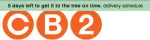
A site-wide banner on cb2.com counts down Christmas Eve shipping deadline.
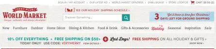
Urgency covers the homepage of worldmarket.com with a countdown to days left for ground shipping in the top right banner position.
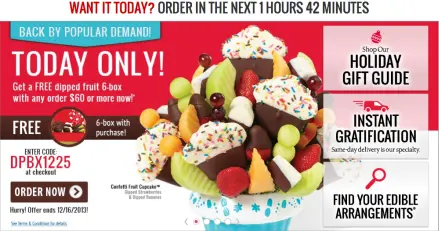
The hero messaging on ediblearrangements.com counts down for same day delivery.
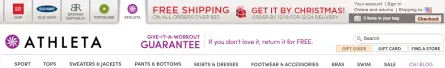
Athleta.com has a site-wide banner promoting both their free shipping offer and order deadline.
Test ideas for the countdown clock:
Test placement on page and on specific URL. Does the countdown appear globally across all URLs on your site?
Test size. The larger the element, the more important it is. Test the size of the countdown relative to other elements on the page.
Test the specific wording. Try framing the deadline in different language or numerical value. For example, “2 days” against “48 hours”.
All of these ideas are easy to implement using split testing tools like Optimizely.
About the author