13 ecommerce conversion tests

Ideas for A/B testing ecommerce conversion rates can come from the darnedest places. When looking for ideas to optimize ecommerce conversions, I personally enjoy studying what the top ecommerce websites (eg. Amazon, Zappos, eBay, MR PORTER, JCPenney, ASOS, etc.) are doing.
What ecommerce key metrics should you optimize for?
The ecommerce key performance indicators you will want to optimize around include: average conversion rate, average order value (AOV) and revenue per visitor (RPV).
- Average conversion rate is the percentage of people who purchase from you divided by your total traffic.
- Average order value (AOV) is the average amount someone spends when they order from you.
- Revenue per visitor (RPV) is the amount of money generated when someone visits your website.
Common tools online store owners use to track and optimize these metrics include: Optimizely, Google Analytics, Magento’s analytics and CrazyEgg.
7 ecommerce optimization tips and tactics
Optimizing your ecommerce store’s conversion can broadly be broken up into 2 parts: acquisition and conversion.
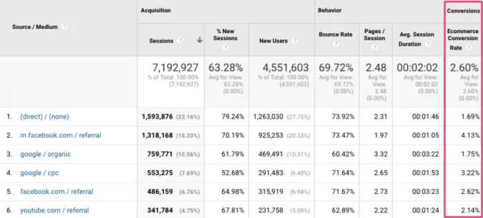
Screenshot of an ecommerce Google analytics account
Acquisition – where is your traffic coming from? If you’re properly tracking conversions, then you will notice that certain customer acquisition channels perform better than others. The customer acquisition scenario means that you’re spending less money acquiring a customer than how much their worth for your business (customer lifetime value).
Conversion – how many people end up purchasing from you? Getting more conversions out of your existing traffic is where the bulk of ecommerce optimization tactics exist. Typical experiments include:
- Offer multiple payment options on your checkout page (eg. PayPal, Apple pay, guest checkout, more credit card options).
- Offer free shipping – as high shipping costs become more subsidized by ecommerce sites like Amazon, it’s important to test different shipping policies.
- Try different product angles – can you get customer reviews and product descriptions that are custom to your website? how about taking high quality product images or product videos?
- Customer support experiments – sometimes all it takes to get more conversions is listing a phone number a customer can call for questions, or having live chat (via Olark or Intercom) option.
- Change your return policy – for higher priced items, it makes sense to try having a more lenient return policy so potential customers can feel comfortable buying and returning the goods.
- Shopping cart abandonment tests – a persistent shopping cart (making sure shopping cart contents stay if someone leaves) can be used to retarget customers that are close to the finish line.
- Test your value propositions – what’s the benefit of the product you are offering? If it’s an umbrella, you run tests to see which benefits (eg. convenience, windproof, style) yield the highest conversion rates.
13 ecommerce conversion optimization case studies
But there’s nothing like case studies from real companies to get the hypothesis juices flowing. Here are 13 ecommerce conversion optimization case studies from Optimizely customers. Each one has a clear takeaway you can use as inspiration for your own test hypotheses. Scroll forth and grow that list of experiment ideas!
SimCity
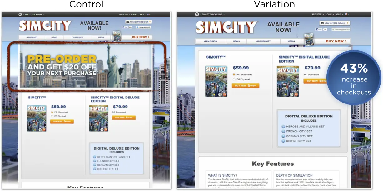
Remove product banner: SimCity sees 43% more conversions without hero banner image
Digital downloads made up 50% of sales for SimCity 5 in the first two weeks of launch. Part of this success can be attributed to a simple A/B test the EA product team ran on the SimCity landing page. The team tested whether or not removing the big promotional banner, thus moving important information up higher on the page, would increase sales.
Takeaway
Question your assumptions. Even when you think something must be absolutely true, test it.
“We found that the variations with the promotional offer actually performed worse than just a clean version of the page. This was really surprising to us, but it had a pretty significant impact,” Mike Burk, a Senior Online Product Manager at EA said.
DeWalt
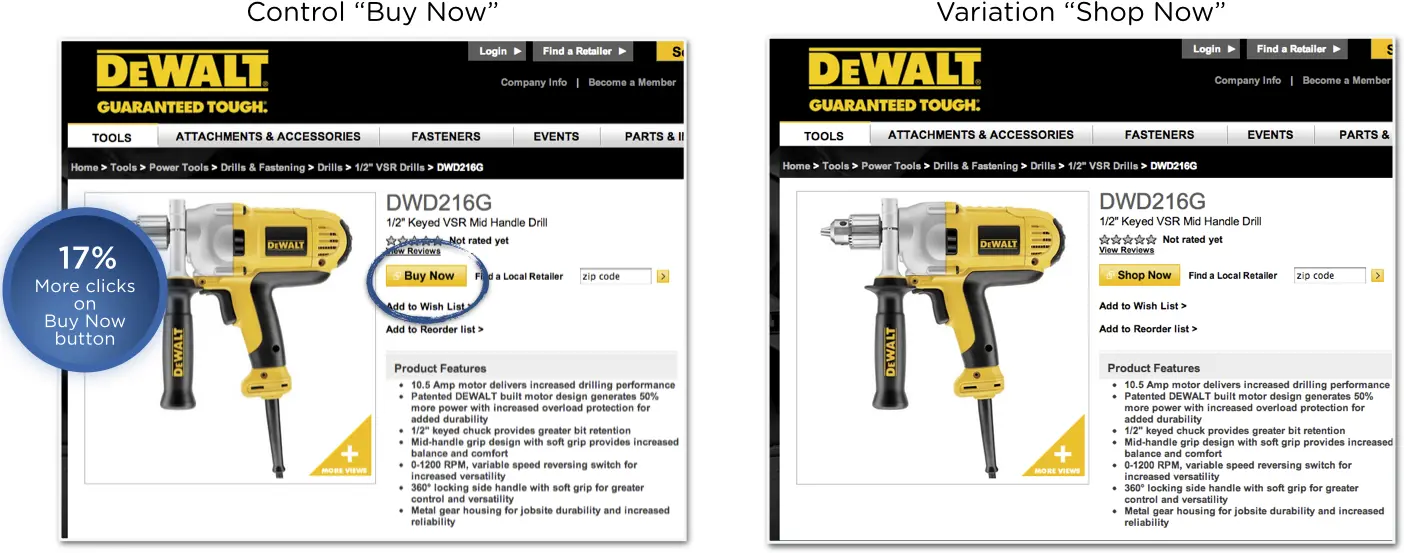
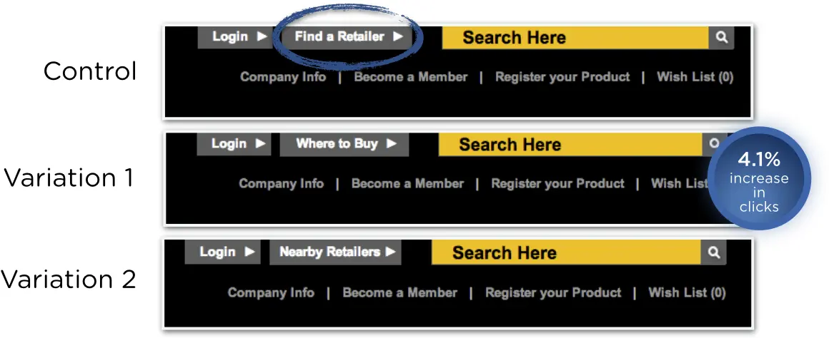
“Buy Now” vs. “Shop Now”: Changes to button text increases clicks 17% for Black and Decker
DeWalt, one of Black and Decker’s brands, tested the call to action buttons on various pages of their site. CTAs appear on so many pages throughout the site and are fundamental to the purchase path. Their goal was to drive more visitors to vendor landing pages to buy power tools.
Takeaway
Small words matter. Even two words on a button can have a dramatic impact on key success metrics. Read more about copywriting for conversion.
Smartwool
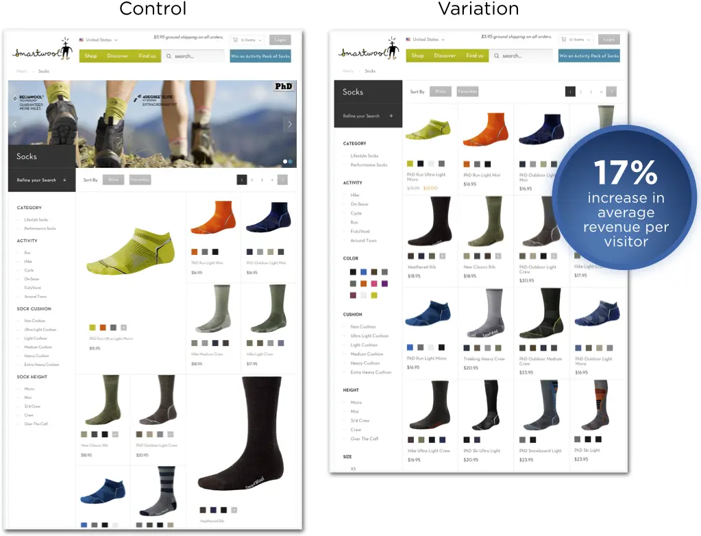
Use a well-defined grid layout for your online shopping experience: Uniform product page images increase ARPV 17% for Smartwool
Despite how fantastic the Smartwool and Blue Acorn teams thought the control product page looked, a more uniform design turned out to be better for conversions. They found that using repetitive image attributes enables better eye tracking when scanning a number of products.
Takeaway
When it comes to product page layout, sometimes the tried and true design works best. Making a product image bigger may lead to more clicks on the product, but that doesn’t always guarantee checkout.
LifeProof
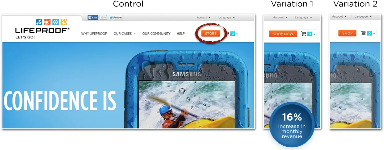
Experiment with call-to-action text: Simple button CTA change increases monthly revenue 16% for LifeProof
LifeProof is an electronics accessory company specializing in cases that protect smartphones and tablets from extreme conditions. They experimented on homepage CTAs and found that small changes in the copy made a big difference.
Takeaway
On call to action buttons, give people an action to take. Promoting “Store” was not as effective as telling people “to Shop Now”
VeggieTales
Eliminate elements from the checkout process: Removing navigation bar from the checkout funnel increases RPV 14% for VeggieTales
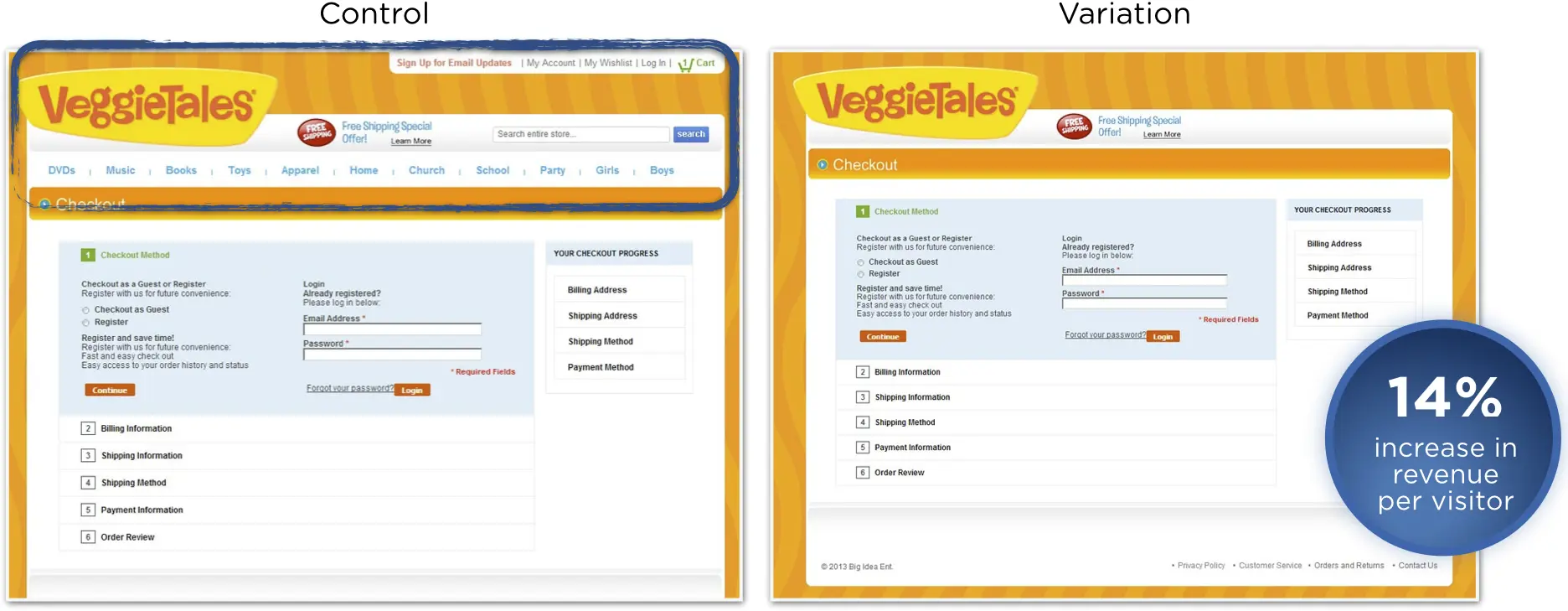
VeggieTales is an animated children’s TV series, hugely popular with pre-schoolers in the United States. In partnership with Blue Acorn, they ran a series of tests on their ecommerce store that increased sitewide revenue by 38%. In this one experiment, they removed the top navigation from the checkout funnel pages.
Takeaway
Don’t give shoppers too many options, especially in the conversion funnel. Removing distractions and possible places to exit the highly lucrative series of pages like the checkout funnel helps keep shoppers focused on checking out and decreases shopping cart abandonment.
FSA Store
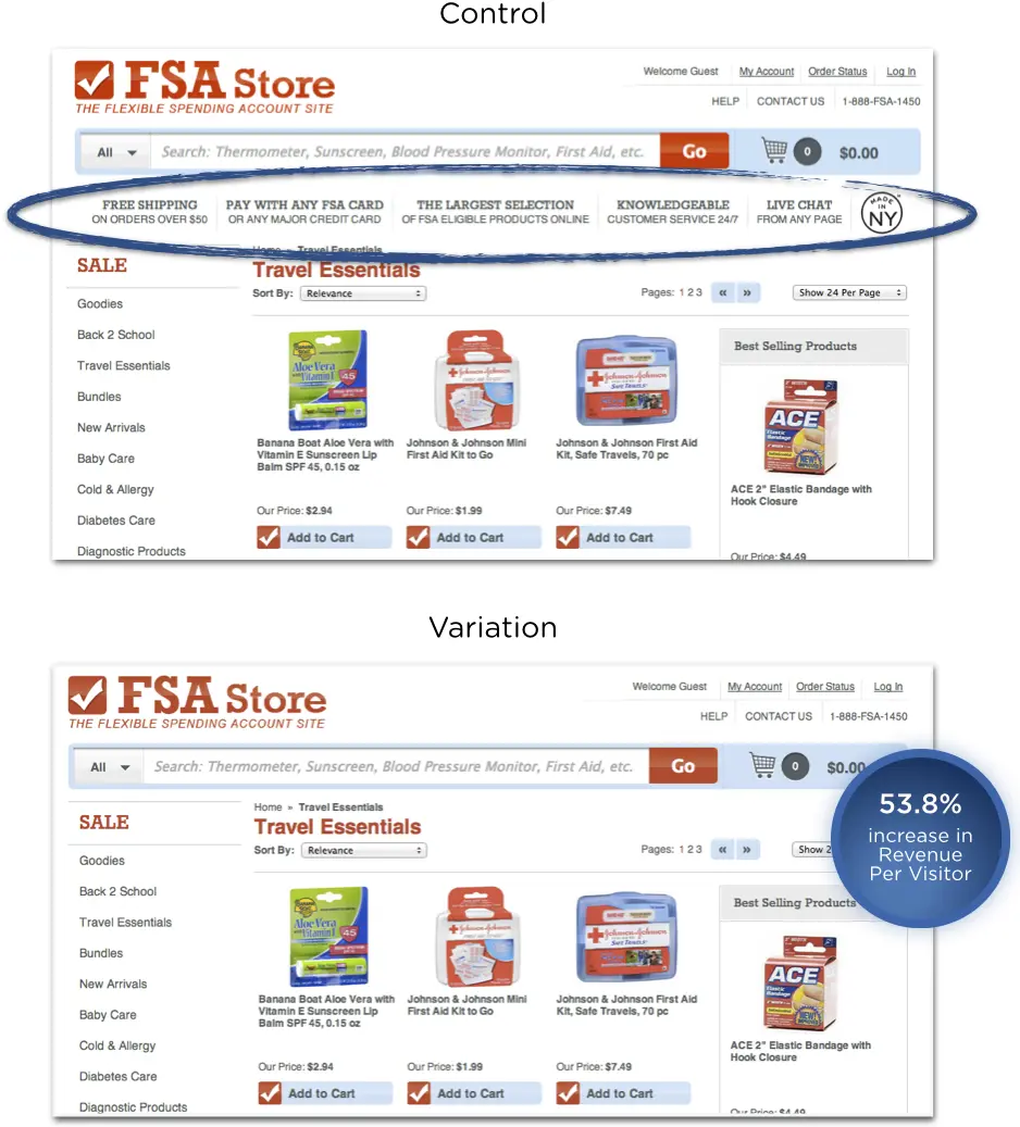
Eliminate elements from your directory: Removing subcategories from homepage lifts revenue per visitor 53.8% for FSA Store
FSAstore.com is a one-stop destination for Flexible Spending Accounts (FSAs), where visitors can search for and purchase FSA eligible products. The team hypothesized that removing subcategories from the homepage would help site visitors focus on the products featured on each category page, driving more through to make a purchase. They were right, very right.
Takeaways
Removing distractions is smart. Fewer options led to higher conversions.
Communication between teams leads to better testing.
“You can’t argue numbers. We absolutely believe in sharing results with everyone internally because you never know what tests on our homepage could affect customer service and what ideas they might have,” Ujjwal Dhoot, Chief Marketing Officer at FSAstore.com said.
Discover Why Forrester Recognized Optimizely as a Leader
Roller Skate Nation
Add a frequently asked questions section to product pages: Having product FAQs increases conversions 69% for Roller Skate Nation
Online shopping can be difficult because you never know exactly how an item will fit. Roller Skate Nation knows this all too well. In person, shoppers frequently ask about sizing and how to go about picking the right fit. The team at Rollerskatenation.com decided to bring some of the offline world online and experiment with adding sizing tips to product pages. They tried placing tips in two different places. They found that placing the image below the product information increased checkouts by 69%!
Takeaway
Make sure shoppers have enough information to make an informed decision. Additional information to help the shopper make a decision, especially if you know it’s a frequently asked question, can be a powerful tactic for conversion rate optimization.
Insound
Try returning different products in product search: Testing new product search algorithms at Insound leads to 39% conversion lift
Insound is an ecommerce website that sells audio equipment and vinyl records. Clearhead worked with Insound to define and test four permutations of their search results page, based on different factors weighing the algorithm. They found that subtleties in the way search results are displayed have a significant impact on a visitor’s likelihood to make a purchase and the average order value (AOV) of purchases.
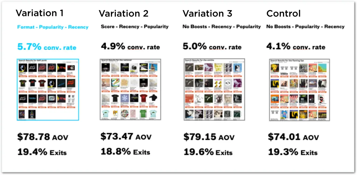
Takeaway
Ecommerce search is a powerful conversion lever. While it’s a less visible part of the user experience, optimizing search algorithms is a very powerful hypothesis and area to focus.
Sony
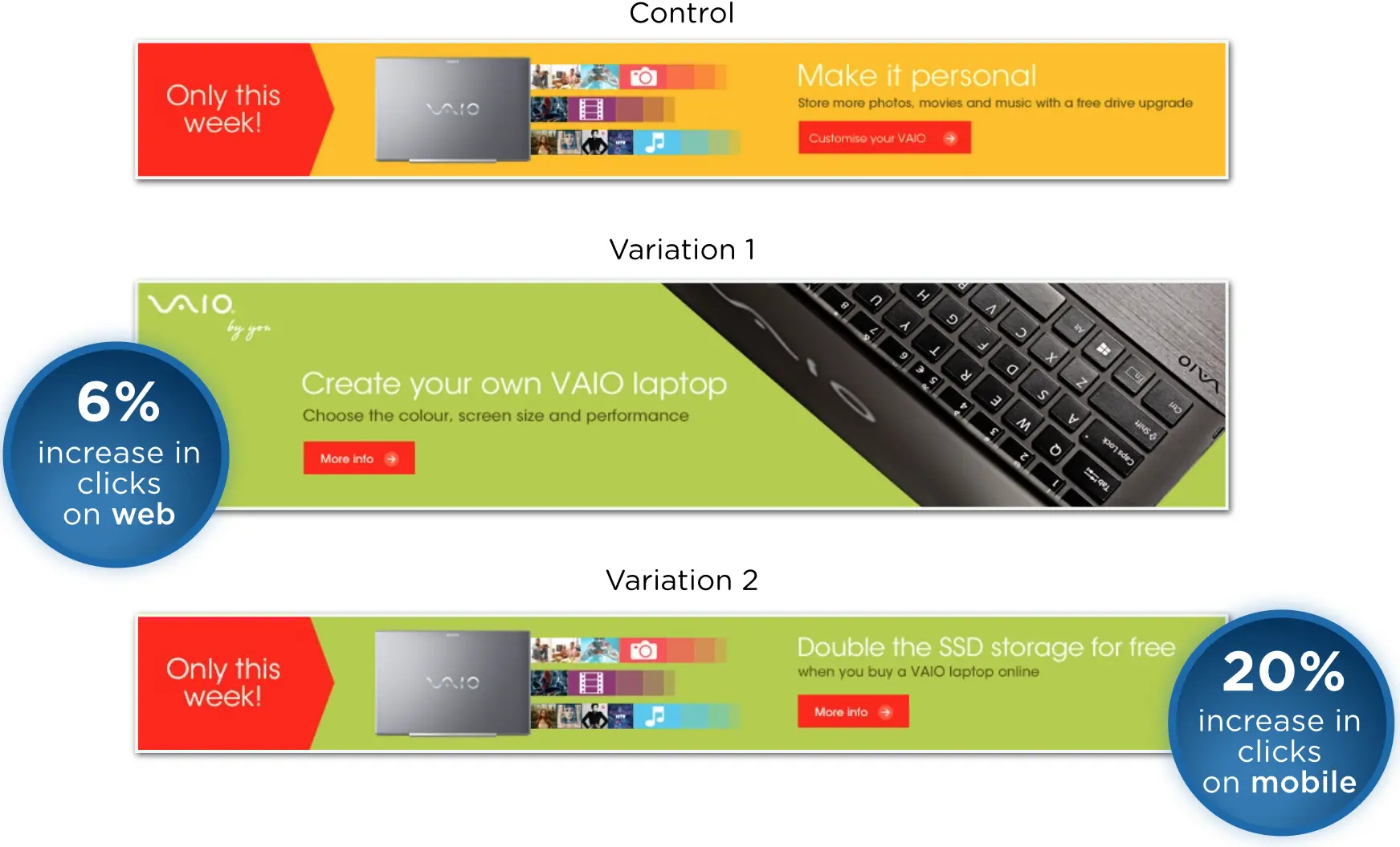
Test performance across different device types: Banner product promotions convert differently on desktop and mobile for Sony
Sony A/B tested on-site banner ads for the Vaio computer. The goal was to discover which call to action was more enticing: customizing a notebook or a free memory upgrade? Rather than one offer winning across the board, Sony discovered that visitors reacted differently to each ad based on where they were browsing.
Takeaways
Tailor content to mobile environments. The environment has a significant impact on what sort of information shoppers need and actions they’re willing to take. Do not forget to analyze A/B test results based on different segments of traffic.
Tablet and desktop are not the same. You should not assume that disruptive experiences that look (and perform) great on tablets or phones will translate well to the desktop, where the majority of shoppers still exist.
Insound
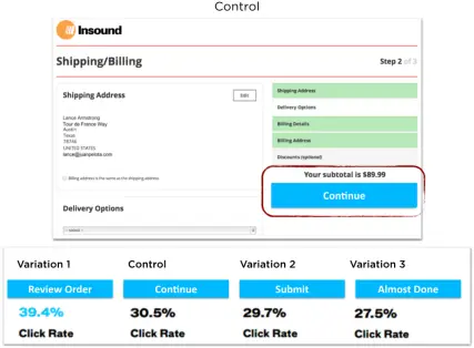
Try different checkout page copy: Testing checkout funnel button text increases click rate 39% for Insound
In partnership with Clearhead, the the Insound team suspected that repeatedly using the “Continue” button in the funnel was causing confusion and leading to abandonment on Bill/Ship details page of the checkout flow. They believed a more specific or enticing call to action button would improve conversion rates. See the variations and performance below.
Takeaways
Be precise in the checkout funnel. Customers want to know exactly where they are in the process and how many steps remain until the end.
Digital optimization strategists cannot predict the habits of thousands of website visitors. Not only did “Review Order” increase conversion on the page by 8%, it beat all other variations by well over 30%. With the “Review Order” button, this page now has a 54% conversion rate and a much lower cart abandonment rate.
Soccerloco
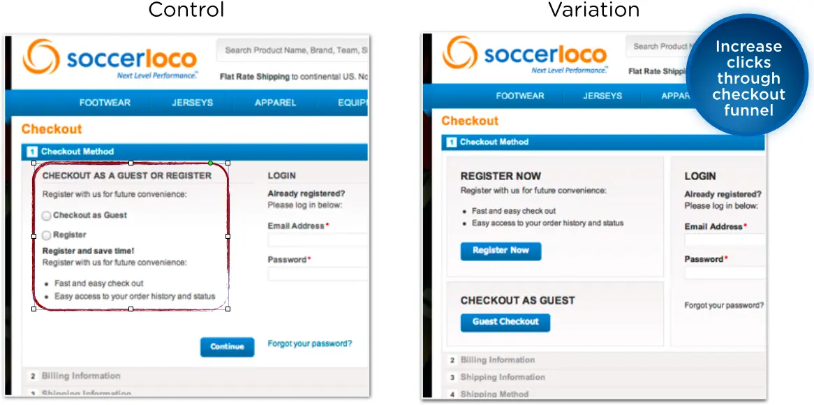
Test different user experiences (UX): More visual cart design lifts revenue for soccerloco
Soccerloco is a multi-channel retailer for soccer gear. As part of a broader site redesign with agency Digital Operative, they made a few hypotheses on areas to improve usability and conversion — one of them was the checkout funnel. They tested a more visual cart design that incorporated buttons instead of radio buttons. The buttons were more successful driving clicks through the funnel. This was one of multiple tests that led to a 26% lift in revenue for soccerloco.
Takeaway
Presenting the same information in a different visual way is a strong hypothesis for an experiment.
Bigstock
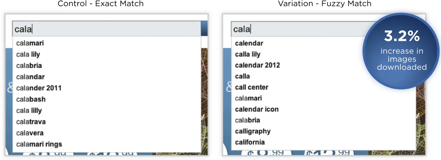
“Exact match” Vs. “Fuzzy Match” Search Algo: New photo search algorithm increased downloads by 3% for Bigstock
Bigstock is a stock photo website and subsidiary of Shutterstock. They are always trying to suggest the most accurate search results to people searching for photos. They tested the performance of a new search algorithm they called “fuzzy auto suggest” algorithm which guessed the intended term if the word was spelled wrong (for example, the commonly misspelled word “calendar”). They tested it against the “exact auto suggest” algorithm that populated results based off the exact search term.
People selected results from the the fuzzy auto suggest 9.6 % more often. They saw significant improvements throughout, including a 6.52% increase in the number of images added to the cart, and a 3.2% increase in downloaded images.
Takeaway
Focus on the big pieces first and do exploratory work before optimization work. For example, try out entirely new algorithms or page layouts first, and then do smaller tests.
ZAGG
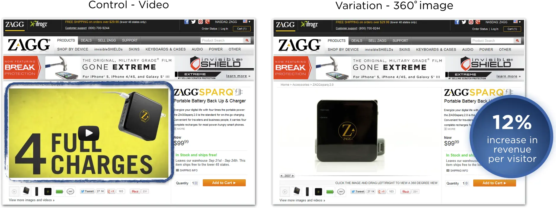
Have high quality product images: ZAGG increases revenue per visitor 40% testing product image types
ZAGG is one of the largest ecommerce sites for mobile electronic accessories. The product pages on ZAGG.com offered three ways to view products: static images, video, and 360º product images. The conversion and usability analyst ran a series of tests to figure out which product image type was best to lead with. He found that video increased RPV by 27% and then leading with 360º video increased it another 12%.
Takeaway
Before you fully invest in product image designs, test them. Product images are not cheap. Before you invest in displaying the product one way across the site, experiment with different styles and formats.
