3 Key Ingredients for High Converting Landing Pages
First impressions matter. And, for many online visitors, a landing page is the first impression or interaction they’ll have with your business.

Robin Johnson

You know you want to address the customer, you want them to have a call to action and you want to rank well for SEO. But what are the other important factors that will make for a great landing page experience that leads to conversion.
Visitors will typically arrive at a landing page from Google AdWords, social media, display advertising, or as part of a product launch campaign – the goal being that visitors to the page complete a desired action like sign up or submit their email. Optimizing landing pages on your website enhances the user experience and is a much more effective, ROI-friendly way to drive conversions than by just throwing more traffic at the page be that through search engines or more money spent.
One of the most high-impact ways to boost top-of-the-funnel conversions is through A/B testing and therefore optimizing your landing pages. Landing page optimization is a method of improving your landing page design to increase engagement, generate more leads, and produce more desired actions for your product/service. Landing pages are lucrative places to focus your optimization efforts because they are the hub of lead generation efforts for your business, and quite often, they’re templatized. Uncovering a win on one landing page could lead to exponential wins on similar landing pages as well.
What Are Good Landing Page Conversion Rates?
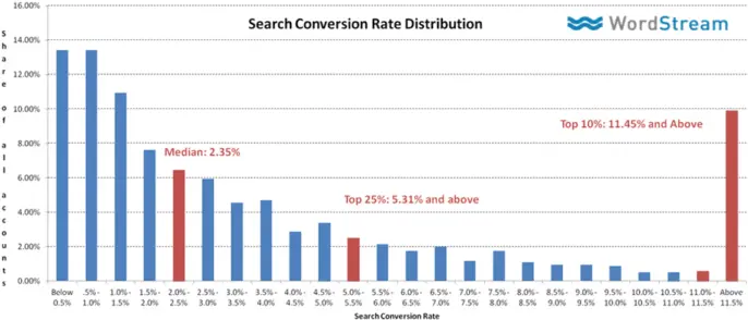
According to research done by WordStream, the median conversion rate from search traffic is 2.35%. That’s a good number to aim for when you’re first getting started but keep in mind that there’s going to be large conversion rate fluctuations depending on customer acquisition channel and industry.
For example, if you run a fashion ecommerce store then chances are Pinterest ads are going to convert way better for you than using Google Adwords. Also, if you are selling expensive software, then you can expect lower conversion rates than if you’re selling songs for $0.99 per file.
So now that we know generally what conversion rate to be aiming for, what elements should we optimize for the perfect landing page?
Here are some key ingredients to help you build a well-optimized, high converting landing page.
The 3 Ingredients for a High Converting Landing Page
- Congruence and context – A successful landing page matches the expectation and need of the visitor based on their previous interaction with your business, whether they clicked through an ad, social media, or other initial channel. Typical things to watch out for when considering conversion funnel congruence include:
- Test your main headline – Your unique selling point (USP) is literally the first thing a potential customer will see on your website. Try experimenting with different benefits of your product–if you sell juice, then you can try saying, “highest quality ingredients” or “look better in your yoga pants”.
- Experiment with hero images – Hero images are the big banner photos that are placed at the top of landing pages. Having a unique hero image is a great way to add a personal touch to your product or homepage experience.
- Trust and value – Through compelling copy and a clear value proposition, the landing page clearly articulates the value of what is being offered to a visitor and establishes credibility for your business. Here are some ideas of how to leverage trust on your landing pages:
- Add live chat functionality – Live chat can be a great way to enhance the customer experience and show that “the lights are on” for your online business.
- Write relevant blog post series – You’d be surprised how many potential customers poke around your website for supporting materials to verify that you’re a “legit” business. Writing blog posts around topics relevant to your industry can be a great way to show people you know your stuff.
- Ease and simplicity – The design of your landing page limits the number of actions a visitor has to take on the page, making it incredibly easy for them to convert. Common tactics the best landing pages do to improve user experience include:
- Decreasing page load time – Since more and more folks are browsing the internet on their mobile devices, page load speeds have increased in significance. The slower your website load time, the more inconvenient it is for your target audience.
- Decreasing form length – There have been multiple studies showing that one-field forms have much higher conversion rates than multi-field opt-in boxes. You’ll have to play around with adjusting what information you want to capture (eg. email address, phone number, company size) and how that affects conversions further down the funnel.
These ingredients are the foundation of any successful landing page and can be applied directly to the design, user experience, and content of each page you build. Let’s take a look at what that looks like in practice, and how testing and optimization can help you get there.
How Add These Ingredients to Your Own Landing Pages
1. Congruence and context
A successful landing page uses congruence and context to keep users focused and interested in whatever your page has to offer. Congruence is the concept of ensuring that each element supports your core value propositions. Context reminds visitors why they landed on the page in the first place. Matching their expectation is key.
Start with a clear headline
Your landing page’s headline will likely be the first thing a visitor notices once they arrive, so make sure it’s clear, consistent, and emphasizes your value proposition, like Apple’s product landing page for the Apple Watch. The headline makes their message very clear: “The Watch is here.”
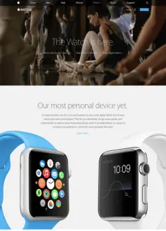
The Apple Watch landing page.
A few ways to optimize your headline:
- Experiment with making your headline as specific as possible. Chances are, when users know what they’re going to get, they’ll be more likely to convert.
- Test the tone you take with your headline messaging. Try emphasizing benefits versus loss versus a question to visitors to see which drives more conversions.
Provide a consistent experience
Your landing page should mirror the message and design of whatever channel (ad, social, etc.) users clicked through to arrive there. Consistency reminds users why they landed on the page in the first place and provides a more seamless, high converting experience.
Our most successful landing page test was a three-word change that made our Pay Per Click landing page symmetric with our SEM ads – this experiment saved Optimizely hundreds of thousands of dollars and lead to a 39% increase in sales leads.
Stay focused with the “1-1-1 Rule”
In most cases, you’ll want to follow the “1-1-1 Rule”: one value proposition, one clear message, and one CTA for each landing page you build. Trying to pack too much into your landing page will only serve to distract users from the goal at hand: converting.
2. Trust and value
Consider the top questions users may have and try to answer these questions upfront through clear, compelling copy on the landing page.
Emphasize what you have to offer
“What’s in it for me?” will likely be the first questions visitors have upon arriving on your landing page. That’s why it’s critical to make it easy for them to understand the value and benefit your business has to offer – whether that’s a specific product, piece of content, cat meme, or other offering. Understand what you have to offer and make sure to emphasize that value proposition clearly in your form.
Here’s how trust and value work:
Example 1: Landing page lacking a value prop:
“Register for our monthly newsletter now!”
Example 2: Landing page with a strong, clear value prop:
Register for our newsletter! Each month, you’ll receive:
- The latest product and feature updates
- Case studies from industry leaders
- Exclusive, VIP invitations to upcoming events in your city
- Tons of cat memes!!!
Example 1 provides very little information and does nothing to show visitors the value the newsletter will provide. On the other hand, Example 2 has a clear, strong value proposition. It details how often readers will receive the newsletter (monthly) and what benefits a subscriber will receive (product updates, case studies, event invitations, and cat memes.)
A few ways to optimize your value prop:
- Different benefits will resonate with different audiences. Test out different messages (you can even segment them by audience) to see what drives more conversions on your page.
- Try adding the value prop to the header or title of the page to see how it impacts conversions.
Prove that your brand is trusted
Visitors are more likely to convert if they know other people or brands, especially those whom they admire, have done the same. Place emphasis on this by using social proof on your landing pages or any opt-in form on your site.
Social proof can come in many shapes and sizes. Here’s an example from Intercom on their blog subscribe opt-in form.
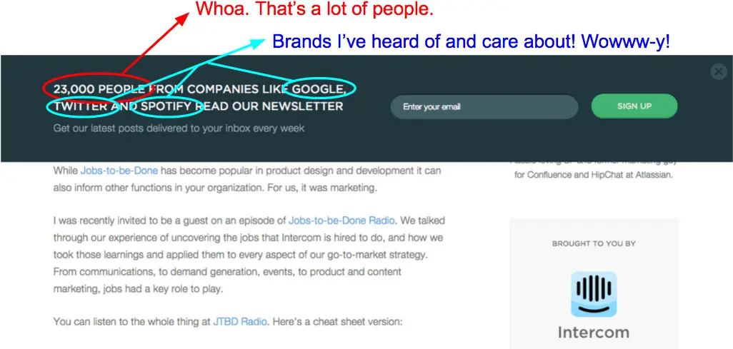
A blog email subscribe opt-in form from Intercom.io
Ask your customers or industry influencers for a quote about why they use your product. Some brands opt to use customer logos as a form of social proof, a strategy that was hugely successful for comScore, increasing leads generated by 68%. Many successful landing pages include the number of social followers or “Likes”, or the total number of subscribers to an email list as social proof as well.
Ideas for optimizing social proof include:
- Experiment with adding customer logos to your landing page.
- Try showing the number of Facebook followers or “Likes” your brand has.
- Add a quote or brief testimonial to see if it improves landing pages conversions.
3. Easy to convert
The design and user flow of your landing page should make it insanely easy for users to convert in seconds. Here are a few ways you can achieve that.
Leverage your CTA
Once you catch a user’s attention, the CTA on your landing page is the most powerful way to nail that conversion. Make your call-to-action button as eye-catching as possible, like this big, colorful example from Marvel App.
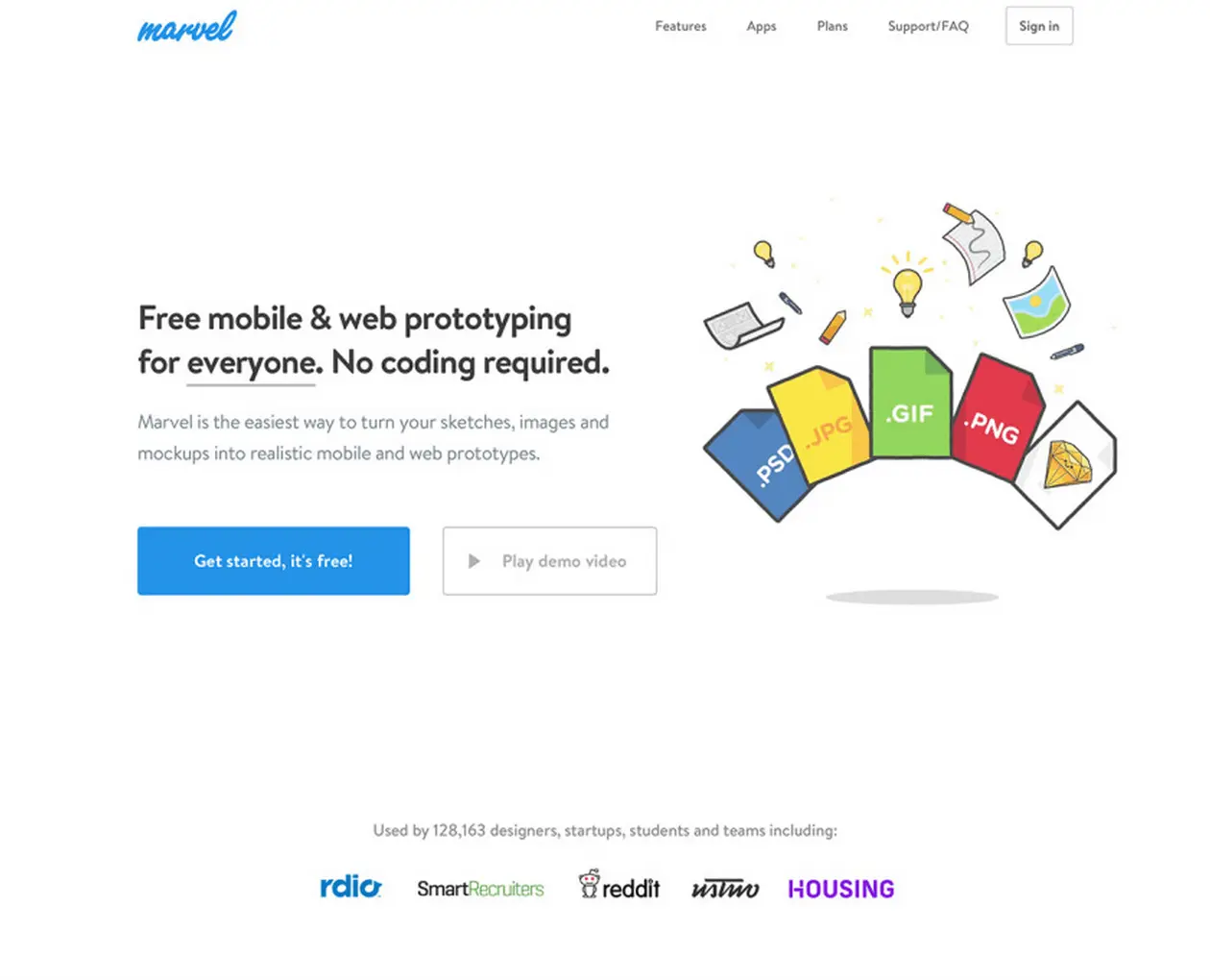
A landing page from Marvel App.
Your CTA copy can also have a tremendous impact on sign-ups – for Code.org that translated into 12 MILLION more sign-ups. Depending on the audience, different messages might resonate more strongly, which is where testing and optimization can come into play. For instance, try adding your value prop into the CTA message (“Sign-up now!” vs. “Sign-up for daily deals!”).
Some test ideas to try on your form CTA include:
- Experiment with different designs to make the call-to-action button pop.
- Optimize for button proximity. Try making the CTA button as close to the form field as possible, so a reader’s eye is drawn naturally to it as a next step.
- Experiment with your CTA copy.
- Check out more ideas for optimizing your CTA button in this post.
Optimize your lead generation form
The goal of many landing pages is to collect visitors’ information using a lead generation form.
Prominence, design, and and ease-of-use are all extremely important elements of a successful landing page lead generation form. The ease at which readers can locate the form and input their information plays huge role in garnering subscriptions and sign-ups.
Take this example from Slack. They do a great job in making the lead generation form as prominent and easy to use as possible. It was the first thing that caught my eye when landing on the page, and I only needed to complete two simple form fields to get going.
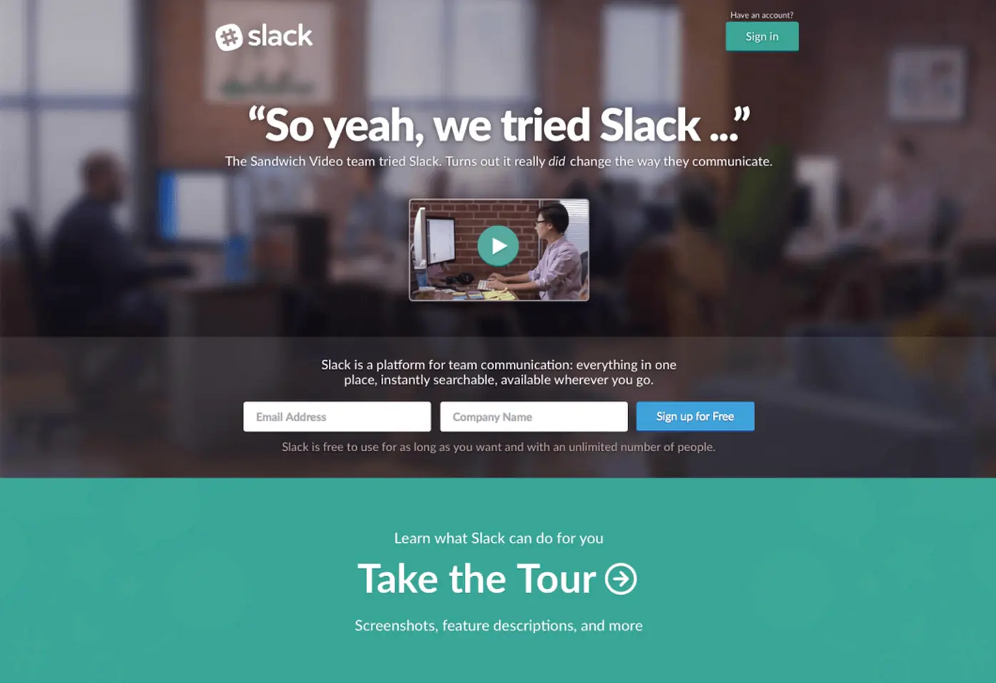
A landing page from Slack.
Focus on making each element of your form as eye-catching as possible… and keep it simple. Your team may want to collect as much information as possible, but since information gathering comes at a cost, it may not be worth it. Take Expedia as an example: The company found that removing just one form field (an address confirmation field) from their purchase form increased annual profit by $12 million dollars. It is definitely a dance to balance the landing page needs against the customer’s desires, which is why the landing page copy is so vitally important.
A few ways to optimize your lead generation form include:
- Experiment with different imagery. Adding images (in particular, those of people) will help evoke an emotional response from users and make them more likely to pay attention to that area of the page.
- Try increasing the size of your form fields. Oftentimes, larger form fields are more likely to catch a reader’s eye.
- Keep it simple. Experiment with removing all unnecessary form fields to increase your overall completion rate. You can always follow-up with engaged users to progressively build on the information you already have.
- To collect accurate information, make sure visitors know with certainty what information you’re asking them to submit. Experiment with autocomplete options or different labels for each form field.
Conclusion
Landing page optimization is one of the most powerful ways to increase leads, subscriptions, and sign-ups, and small changes can have an incredible impact. And as with anything remember you are trying to address your customers’ pain points so while you may want to gather more information, it is the customer who has to remain front and center as you design these experiences. The ingredients outlined in this post provide a great starting point. You can easily apply them to your current landing pages or create a completely new form with them in mind. Of course, what works for one (or even most) landing pages won’t always be the best option for yours – and there’s always room for improvement. A/B test and optimize each of these elements to maximize your conversion rate from your unique audience.
Have more tips or suggestions that have helped you improve the performance of your landing pages? Share them in the comments!
