Introducing Multi-page Experiments (a.k.a. Conversion Funnel Testing)
We are excited to announce multi-page experiments on Optimizely! Lots of our customers want to A/B test not just one, but two or more pages that are related, often as part of a funnel.

Multi-page experiments allow you to “link” together related variations of different pages: visitors who see the original version of Page 1 will also see the the original version of Page 2, visitors who saw a specific variation of Page 1, will see a corresponding variation of Page 2. This allows you to maintain a consistent user experience through a sales funnel or even across your whole website. Multi-page experiments are available to Optimizely customers with Gold and Platinum plans.
As an example, let’s say we want to test whether customers are more likely to buy an item called a “large coffee mug” or a “portable coffee reservoir.” If we ran an A/B test on the product page only, visitors who saw the “Reservoir” variation would still see the “Original” version of the checkout page and might think the wrong product was added to the cart:

With a multi-page experiment, we can create “linked” variations across both of these pages to provide consistent product marketing. Start by selecting the “Multi-page” experiment type:


Now we can add the checkout page to our experiment. Notice that a “Reservoir” variation, linked to the product page “Reservoir” variation, will automatically appear:


We can then modify the “Reservoir” variation of the checkout page to be consistent with the “Reservoir” variation of the product page. Here, we will change the product name to be consistent with the product page “Reservoir” variation:

Variations with the same name, including the “Original” (or control) versions, will be “linked” together ensuring a consistent user experience across the pages included in the experiment. In fact, if this same product was referred to as a “large coffee mug” on a third page, we could go ahead and add that page to the multi-page experiment as well.

The pages in a multi-page experiment do not need to be viewed in any particular order, or even at all, by a visitor.
TL;DR
- Visitors who saw the symmetric version of our PPC landing page converted to sales leads more frequently than users who saw the non-symmetric version, with high confidence.
- The observed improvement in conversions from visitors to sales leads was more than 39%.
- This symmetry experiment saved Optimizely hundreds of thousands of dollars and led to tens of thousands of additional sales leads.
Background
You may have heard that keeping your ad consistent with your landing page is good. But is that a myth? And if it isn’t, how can you quantify the impact of this symmetry? In early 2013, we performed an experiment on our Pay Per Click landing page aimed at answering these questions. Our goal was more to answer an interesting question than to find a conversion lift, but we were pleasantly surprised to discover that making our landing page mirror our ads led to a tremendous lift in conversions.
The experiment
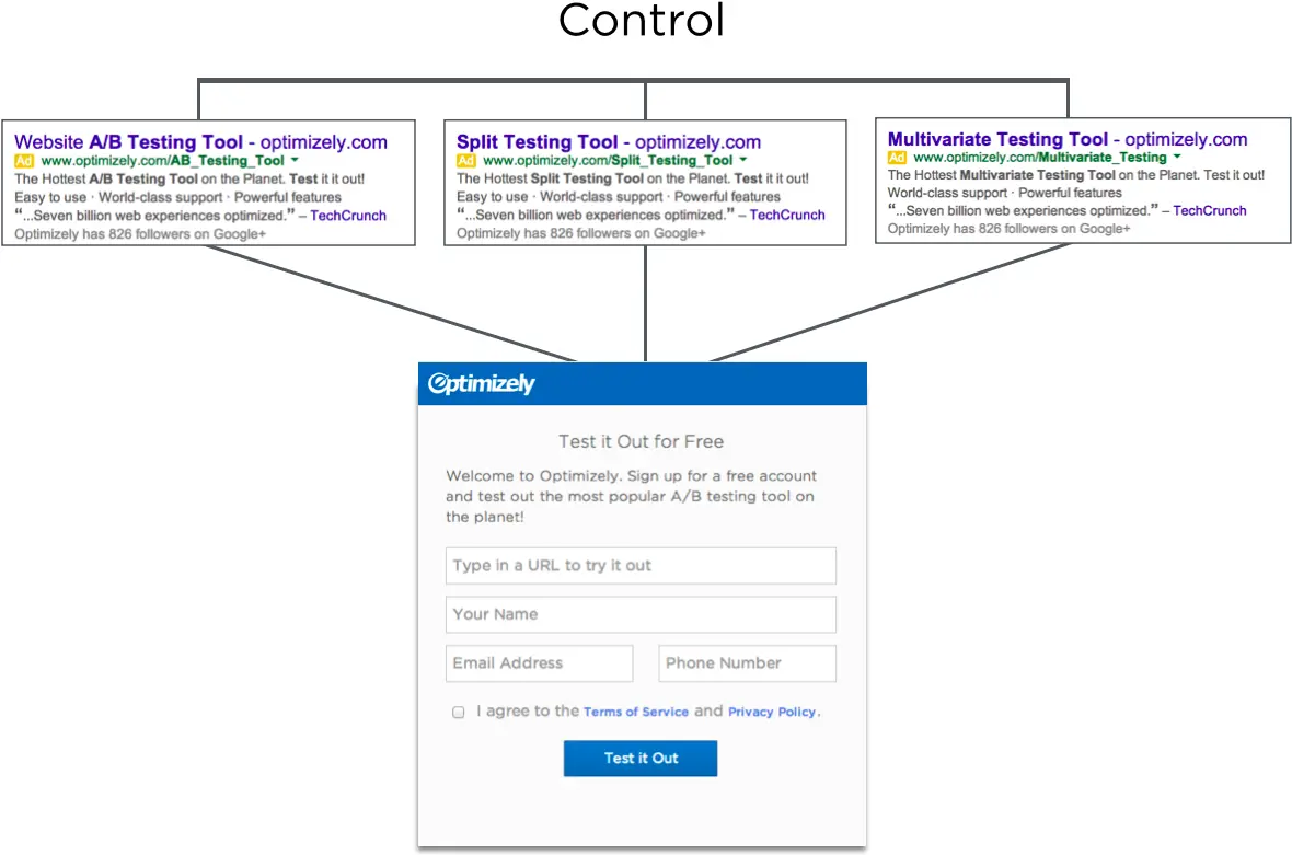
We send traffic to our PPC Landing Page from lots of advertising campaigns, including search marketing campaigns. In some of our SEM ads we call ourselves an “A/B testing tool” and in others we call ourselves a “Split testing tool” and so on. These are all valid ways to describe Optimizely, but some people think about our space differently.
In the control, the headline of the page was always the same. It always said “Test it out for free,” no matter which ad the user had clicked on.

