This Team Has Data, Not Opinions: A/B Testing at the Romney 2012 Campaign
From day one, Mitt Romney’s digital campaign team understood a common truth: the campaign is not a creativity contest – what looks best and what works best for the website is not always the same.


“We tried to be very conscious that this team doesn’t have creative opinions, this team has data,” says Ryan Meerstein, a senior political analyst from Targeted Victory, the agency who ran testing and optimization for the Romney campaign. “It’s hard for the team to argue with a graph that proves what works and what doesn’t.”
The graphs were results from AB testing – lines that showed how two different versions of a web page performed over time. Rather than have protracted discussions on the design that could work best, the team tested and gathered data to inform every design decision.
The team went for the low hanging fruit first: email sign-ups. They hypothesized how different combinations of graphics, headlines, forms and color impacted a visitor’s decision to sign up for email updates from the campaign.
From the start, the team considered increasing email sign-ups on mittromney.com a primary goal.
“Email is still the golden goose of fundraising when you’re making direct solicitations,” Meerstein says. “We’re seeing each email valued at anywhere between $7-8 in future revenue.”
Knowing how beneficial email was to raising money for the campaign, they tested heavily on the homepage and splash pages of mittromney.com always optimizing for email sign-ups. Among AB testing tools, Optimizely was their platform of choice.
“There were some hesitations in our shop to use Optimizely because of past connections,” Meerstein says. “But we got past that and started to use the product and found it just far superior to any of the other ones we were using prior.”
Between May 2011 and November 2012, the Romney campaign’s 140-person digital team along with Targeted Victory ran hundreds of tests.
“Once we saw the ease of using Optimizely, the ideas started flying. We wanted to start testing just about everything,” Meerstein says. “We started on the splash page and when we saw success, we continued to build from there.”
Call-to-action button test
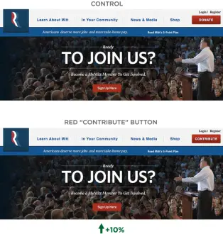
The team started optimizing for donations with a test on the main call-to-action in the right upper corner of the homepage. They wanted to see whether button color – blue, green, yellow or red – and word choice – “Contribute,” “Support”, or “Donate” – impacted the likelihood of a visitor to click.

Overall they found that color did not have a definitive impact, but the word “Contribute” did show a statistically significant improvement of 10%
Knowing that “Contribute” converted visitors to click more often than “Donate,” the team changed verbiage all over the site – and in all email messaging – to reflect the test results.
Home page carousel test
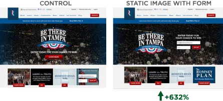
Still armed with the goal of maximizing email sign-ups, the team focused the next iteration of testing on the carousel images on the homepage. A carousel is a rotating slideshow of images that designers frequently use to showcase featured content. They tested using a carousel versus a static image offering visitors the chance to win a trip to the Republican National Convention with the headline, “Be There in Tampa.” The main metric they measured was the percentage of visitors who reached the email sign-up confirmation page.
They tested four variations:
1. The control – A full page moving carousel.
2. A half-height moving carousel.
3. A static image with an “enter to win” form.
4. A static image with a “learn more” button.

Adding the form to the homepage image increased the percentage of visitors who signed up by 632%.
In this case, visitors seldom reacted to the “Learn More” more button. They reacted extremely well to the immediacy of the sign-up form giving them the chance to win with filling out just two form fields.
State specific splash pages
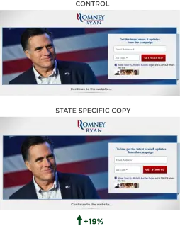
Next, the team used geographic location as a pull to encourage visitors to sign up for email updates. The team wanted to gauge whether visitors signed up more with a message specific to their state or a generic one.
 Simply by adding “Florida” to the call-to-action text, visitors who saw this page entered their email and zip code 19% more often.
#BBD0E0 »
