Try Adding a Countdown Clock to Your Site to Increase Conversions
As the days count down to the last possible moment to place online orders for delivery on Christmas eve, the urgency on home pages and site-wide banners increases. The presence of a countdown could be a great way to drive visitors to purchase.


By mid-December messages like Hurry, shop now while supplies last., Today only! and 5 days left! start to pop up on e-commerce sites everywhere to encourage visitors to make their last minute purchases. As the days count down to the last possible moment to place online orders for delivery on Christmas eve, the urgency on home pages and site-wide banners increases. The presence of a countdown could be a great way to drive visitors to purchase.
See what happens to page views and purchases with the presence of a countdown clock on your site.
Here are some examples of countdowns online retailers are using right now, with countdown clock test ideas below.

A ticker on the homepage of Lenscrafters.com counts down to the days remaining to use health insurance benefits.

A site-wide banner on cb2.com counts down Christmas Eve shipping deadline.

Urgency covers the homepage of worldmarket.com with a countdown to days left for ground shipping in the top right banner position.

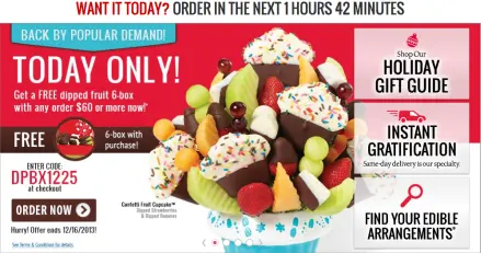
The hero messaging on ediblearrangements.com counts down for same day delivery.

Athleta.com has a site-wide banner promoting both their free shipping offer and order deadline.
Test ideas for the countdown clock:
Test placement on page and on specific URL. Does the countdown appear globally across all URLs on your site?
Test size. The larger the element, the more important it is. Test the size of the countdown relative to other elements on the page.
Test the specific wording. Try framing the deadline in different language or numerical value. For example, “2 days” against “48 hours”.
All of these ideas are easy to implement using split testing tools like Optimizely.

