Test Idea: Variations of Return Policy Messaging on Product Pages
It’s inevitable that millions of dollars of worth of merchandise purchased for holiday gifts this year will be returned to the stores/fulfillment centers from which it came.


Product pages are a sweet spot for A/B testing how you inform shoppers of your easy return policy. Why product pages? Because they get a lot of traffic, and that traffic is qualified. Shoppers have navigated deep into your site to view a specific product, or they’ve come directly from search where they knew exactly what they were looking for. Your job is to turn their intentions into action.
Emphasizing an easy return policy directly on the product page is a great way to do this because it helps to answer common questions upfront and allays fears that if the gifts aren’t wanted, all is not lost. Surprisingly however, understanding the return policy is often a disjointed experience that drives users to long pages of legal text and away from their core shopping experiences.
Your testing goal is to find the best way to promote easy returns without distracting shoppers from completing their purchases. Finding this balance will drive higher conversion rates by addressing the central-most fears present in users’ minds as they gift-shop online.

Original version of J.Crew’s call to action on the product page.
Here are three easy ways to test the impact of emphasizing the return policy directly on the product page. The following images are hypothetical examples of J.Crew’s product pages.
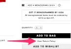
Add a link: Perhaps all that is needed is making it easier to access the return policy page. (Ideally this will anchor to the relevant section and skip sections like “In Store Purchases” etc.)

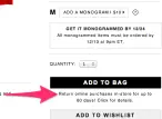
Add a link and description: Link to the policy but describe it in simple terms too. In this variation you may see an increase in conversions even if you don’t drive more users to the return policy page.

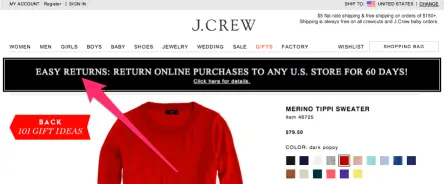
Showcase your return policy with a banner: Users are often looking for coupon codes and promotional imagery in the header of your site. Use this space to emphasize easy returns.

